Lung cancer among
Canadian women is rising according to a study by Statistics Canada.
The 2008 study found
that lung cancer rates among men, however, continue to drop. Overall, cancer prevalence rates for
most cancers increased by 2.1 per cent from Jan. 1, 1997 to Jan. 1, 2008.
I think it’s safe to say no one likes cancer.
I also think that’s why a recent study on cancer prevalence
in Canada caught my eye. I don’t have any concrete proof of this, but I feel
that a lot of time, effort, and money go into cancer research and prevention.
Maybe that’s why I was surprised to see that cancer rates continue to increase.
And the findings in this study suggest that the bout against cancer is going to go the distance. A full 12 rounds.
Now, just how much more powerful would that info be using an
interactive display.
I’m not talking about a grade four science project backboard
display, and I’m certainly not referring to ones such as this:
I've gone cross-eyed looking at this thing. All that information you need to relay to your reader becomes jumbled and hard to understand. Those powerful numbers about cancer prevalence gets lost in webs of fuchsia and aqua green scribbles.
It just won't do.
I’m talking about ones that grab your attention, give you
more information than you realize your getting, and get the point across.
Okay, so I have to write an article about lung cancer rates
increasing among women and cancer of all types increasing overall between the
two sexes.
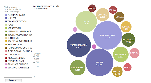
To get my point across and look smart all at the same time, I’d make a visual like this:
Then, clicking one of the spheres, you'd be provided with even more info on that particular cancer. Is it more common in Men? What countries populations are more susceptible at getting it? It is increasing/decreasing?
This provides a education and a knowledge base with far more potency than simple black and white copy. It's engaging and thought provoking. And that's the key to retention and informational regurgitation.


0 comments:
Post a Comment